
If you're interested, I blogged about the process and inspiration HERE. :-)
The second was to get my 'blocking' assignment finished for this month's EB Master Class assignment on "line". In the initial sketches, I "de-constructed" this quilt that had been inspired by this photo and gave EB three possible design options to critique. Her response?

Hmmm. I agree about the vertical line and perhaps moving the 'implied triangle' on the left more into the piece, but I rather like the disjointed lines.
What else?
For the remaining two options, EB commented mainly on this one:

So this week I produced this paper mock-up of 9 repeating blocks:
 |
| 9 repeated blocks on design wall |
Then I created 6 blocks for my potential design -- pinned only, thus:
 |
| "Green Fields" mock-up - WIP |
When I submitted these to EB I told her that I thought 9 would be best, but made up only 6 to see what she thought first. :-)
Her response was, I thought, quite positive:
I love the idea of the spring look...I'd just make one or two more of the greens a little more vibrant... even though you're high key you should have some variation in values...and I'm not sure about that blue grey fabric...it doesn't have the same feel as the others...which look very good very springy with the light showing through...d'you have any that have even more white in them? or one or two sprinkles of a pale pink blossom??
 I agree a bit about the blue-grey fabric (it's actually more blue-green, but "dusty", a hand-dye) and will see if I can scrounge for an alternative from my stash, or dye more.
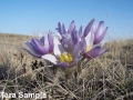
However, I couldn't help but chuckle about the "pale pink blossom". EB is a Brit living, I believe, in the southern U.S., so I forgive her for thinking romantically about flowers dotting the prairie grasslands...but blossoms don't much appear out here on the rolling lands of Central Alberta in the early-mid spring. It's far too chilly! The closest I might get is the pale purple of a prairie crocus...and I might just see if I can hint at that in the fabric strips.
Off to Calgary today for a variety of errands...but this weekend I'll be lining up those strips under the needle of my machine...so stay tuned.
Linking this up to WIP Wednesday over at The Needle and Thread Network. Let's see what my Canadian colleagues are up to, eh?
5 comments:
Yes it is so true, unless you have spent half a lifetime on the prairies of Canada you don't realize the difference from other places. People drive along #1 Hwy and say it is the most boring drive ever, but to me there is something new and fantastic along that way every time I have been there... (tho I really prefer #2 Hwy a bit south)
I really like the six blocks that you have designed, Margaret. Will wait to see where the line drawing is going. Sounds like a real exploration.
You are sure doing some interesting work! Looks great to me, well, maybe not the blue grey! ;^) Our crocuses are now out in Manitoba! funny as I was chatting with my gal student and w were looking at spring images. We weren't relating to all the blossoms! lol
I really like the 6 blocs as well and can agree with EB about the pink. Even if you don't have may spring blossoms it will enhance the piece.
Love the black and white lines as well. Will be very interesting to see what you choose and see the results.
Some really useful comments from EB for you to ponder.
Post a Comment