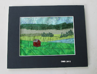
I have 24 mats to fill, many black, white, grey or brown -- but this piece called for colour. The only problem is, I can't make up my mind! Here are the auditions. (Each mat is 8" x 10" with an opening of 5" x 7" -- hence the term "miniatures".)
 |
| "Red Shed" - mat option #1 |
 |
| "Red Shed" - mat option #2 |
 |
| "Red Shed" - mat option #3 |
So...whaddya think?
11 comments:
The first red mat leads my eye to the mat and not to the miniature. Likewise the third one (although not as much) and as soon as I saw the second mat, I knew it was the right one.
Second one for me
Second for me too!
I like that second one best, too. The all red mat might be too much red for your lovely art work. Have you thought about doing two mats? A skinny red mat under that grey one might really make it outstanding.
Yeah, what she (KQ) said. I like the first red mat, since it goes with the accented barn, but it's a bit *too much* red. The blue mat keeps the barn as the outstanding subject to draw the eye into the rest of the image. KQ seems to have found the best of both :)
I vote for the second one too!
Me too! The reds are too distracting. A narrow red inner line might be nice but not the whole thing.
I like #1 and #2.
The red one is bright and fun, and highlights the red shed. While the second one gives a very calming effect to the picture.
I don't think the third one shows off your work as well.
....my 2 cents worth!! :)
Second for sure!
I am a bit late here...the first is really vibrant but it is true that it minimizes your art. #2 is most complementary.
My vote is #2. #1 is good, but a bit too red....
Post a Comment